Be on time, everytime.
A public transportation app
With Busy Bus, never miss the bus again! Find the closest bus stop to you and its most relevant information so you are always on time.
See it in action!
Overview

Duration
Four Weeks
Problem
Due to expansion in service, numerous bus routes have been recently added and many of those routes stop at the same bus stop. Riders feel frustrated as they need information about what the next arriving bus is and how much time they have to get to the bus stop.

Design Role
- UX Research &Testing
- Visual Design
- Front-End Development
Design Deliverables
- Competitive Analysis
- User Survey
- User Personas
- User Stories & Flows
- Wireframes
- Wireframe Prototype
- Usability Testing
- Hi-Fi Prototype

Design Tools
- Google Forms
- Figma
- HTML/CSS
- Git/GitHub
Discovery Phase
User Surveys
Getting to know the users
First things first! In order to solve the problem I needed to understand the people I was creating solutions for. I conducted a survey in order to better understand the frustrations, habits and motivations of the potential users.
User Research Findings
Participant's habits:
- 30% use public transportation apps daily.
- 30% use them at least once per week.
- 82% have used them in the past year.
Participant’s top 3 essential features in a public transportation app.
- Trip planning feature
- Bus schedule
- Alternative routes
Participants identified top 3 competitors:
- Google Maps
- Transit
- Citymapper
Competitive Analysis
Where does Busy Bus sit in the marketplace?
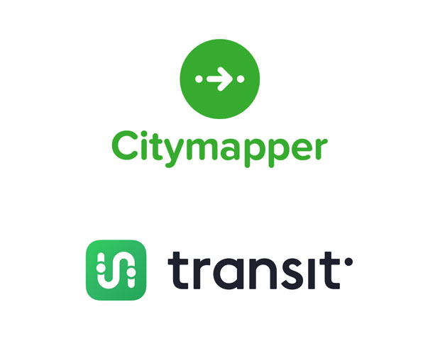
According to the survey’s results, the participants most frequently used public transportation tools were Citymapper and Transit. Both of these tools are user friendly. Yet, in order to retrieve detailed information about a bus stop, users had to plan a trip. Which can be too complicated when users are on the go.
Although there are several competitors on the market, users might be interested in a tool able to retrieve a bus stop information without too many steps in between.
User Personas
Bringing users to life
I created two user personas to help me guide my decisions during the design phase of the project: Sofia and Peter. What would Sofia think about the architecture of the platform? What features would Peter think are the most and least useful? By giving a background, a name, and a face to my potential users I was able to keep my design decisions user-centered.

Sofia
I want a reliable app that will tell me the information I need on the go
Motivations:
- She is conscious about her carbon-footprint.
- Sofia has classes early in the morning and relies on her phone’s applications to be on time.
Frustrations:
- Sofia needs an app that won’t require many steps to retrieve the information she needs.
- She needs an app that has realiable bus schedule updates.

Peter
I need to know exactly when to start walking to the bus stop to catch my bus.
Motivations:
- Peter uses public transportation on a daily basis in order to go to work.
- He needs an efficient way to move around the city.
Frustrations:
- His regular bus is late sometimes and he often arrives late to work.
- Peter lives in an area where it rains often, he needs to know how far is his closest bus stop.
Information Architecture
User Stories and User Flows
Defining user’s goals
Before beginning to design a MVP, I identified some user stories for new and returning users and I ranked them based on their priority.
| Role | Task | Importance |
|---|---|---|
| As a returning user | I want to know what’s the next bus coming to my closest bus stop. | High |
| As a returning user | I want to know how far away the bus stop is from my location. | High |
| As a returning user | I want to plan a trip. | High |
| Role | Task | Importance |
|---|---|---|
| As a new user | I want to know where is my closest bus stop. | High |
| As a new user | I want to plan a trip. | High |
| As a new user | I want to be able to see detailed instructions for my trip. | High |
Paper Prototype
It all begins with pen and pencil
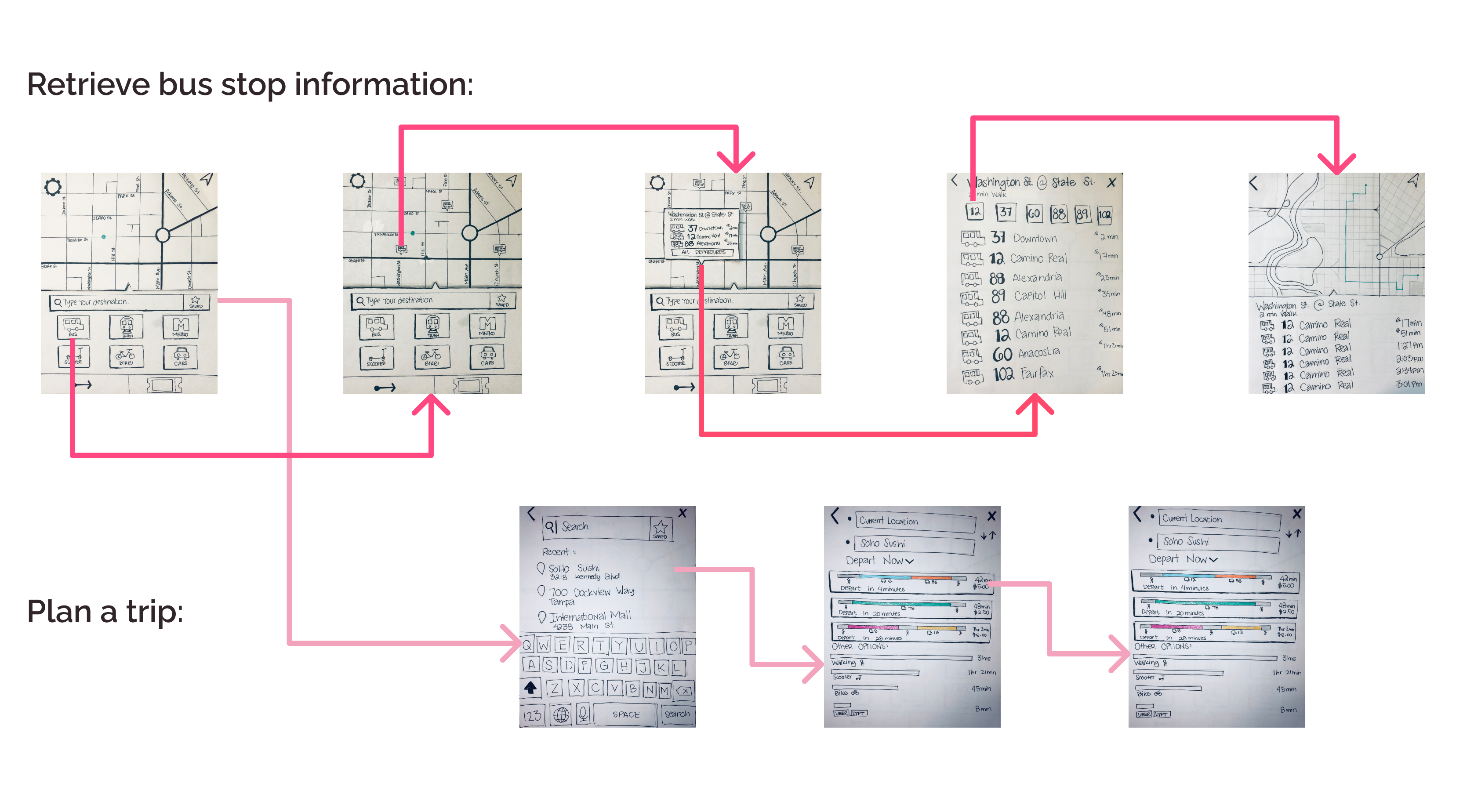
Using the user stories and user flows as a guide, I began designing the skeletal structure of the platform. After designing a solid wireframe, I decided to test my own assumptions with a paper prototype and real users.
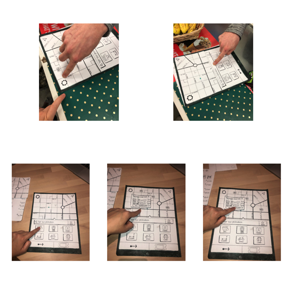
Usability Test
Getting feedback on the foundation
Tasks:
- Find the next arriving bus to the closest bus stop to you.
- Find out how much time you have to get to the bus stop.
- Plan a trip to a restaurant called Soho Sushi.
Findings:
- Participants wanted to plan a trip in order to complete task 1 and 2.
- Process to complete tasks 1 and 2 was too lengthy.
- Process needed to be more intuitive.
Lo-Fi Prototype
Building the foundation
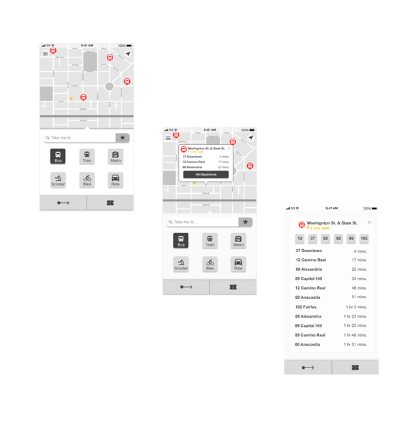
I created a Lo-Fi Prototype with some changes I made from the paper prototype. I showed this first iteration of the prototype to my mentor who gave me some very valuable feedback:
Pros:
- Users can see what’s the next bus coming to their closest bus stop.
- Users can see how long it will take them to walk to the bus stop with just one click.
Cons:
- Although the bus stop card displays the necessary information to solve our problem, due to the size of the card, users can only see limited information about the bus stop.
- Home screen needed better organization. It needed to be more practical and user friendly.
High Fidelity Prototypes
First Iteration
Refining the experience
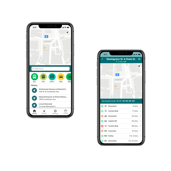
I took the advice of my mentor in to deep consideration and I decided to change the layout of my screen without changing the parts that worked.
Pros:
- Eliminated one step of the flow
- Users had access to more information.
Cons:
- Bus Stop information screen needs to be more user friendly and should prioritize function.

Final MVP
The Final Product
Busy Bus needs to be an app that responds to the questions:
- What is the next arriving bus?
- How much time does the user have to get to the bus stop?
Solution:
- Problem is solved with one click.
- Functionality was prioritized.
- Easy to use.
- Designed with the user’s attitudes, habits, and needs in mind.
Conclusion
Key Learnings
Test for assumptions
Busy Bus was one of my firsts design projects. Throughout its development I learned the value of having an extra opinion and testing with real users. Early in the design process, I had made some design decisions that at the time felt very obvious and user friendly, but when I tested them with real users, I realized that not everyone is going to think exactly how I do. As designers, we are supposed to create products designed for people not for us!
Testing early
The earlier testing starts, the better. This was the first time I created a paper prototype and tested it with real users. I found this experience very useful as it allowed me to see what real users thought about my design without having to create a digital prototype.