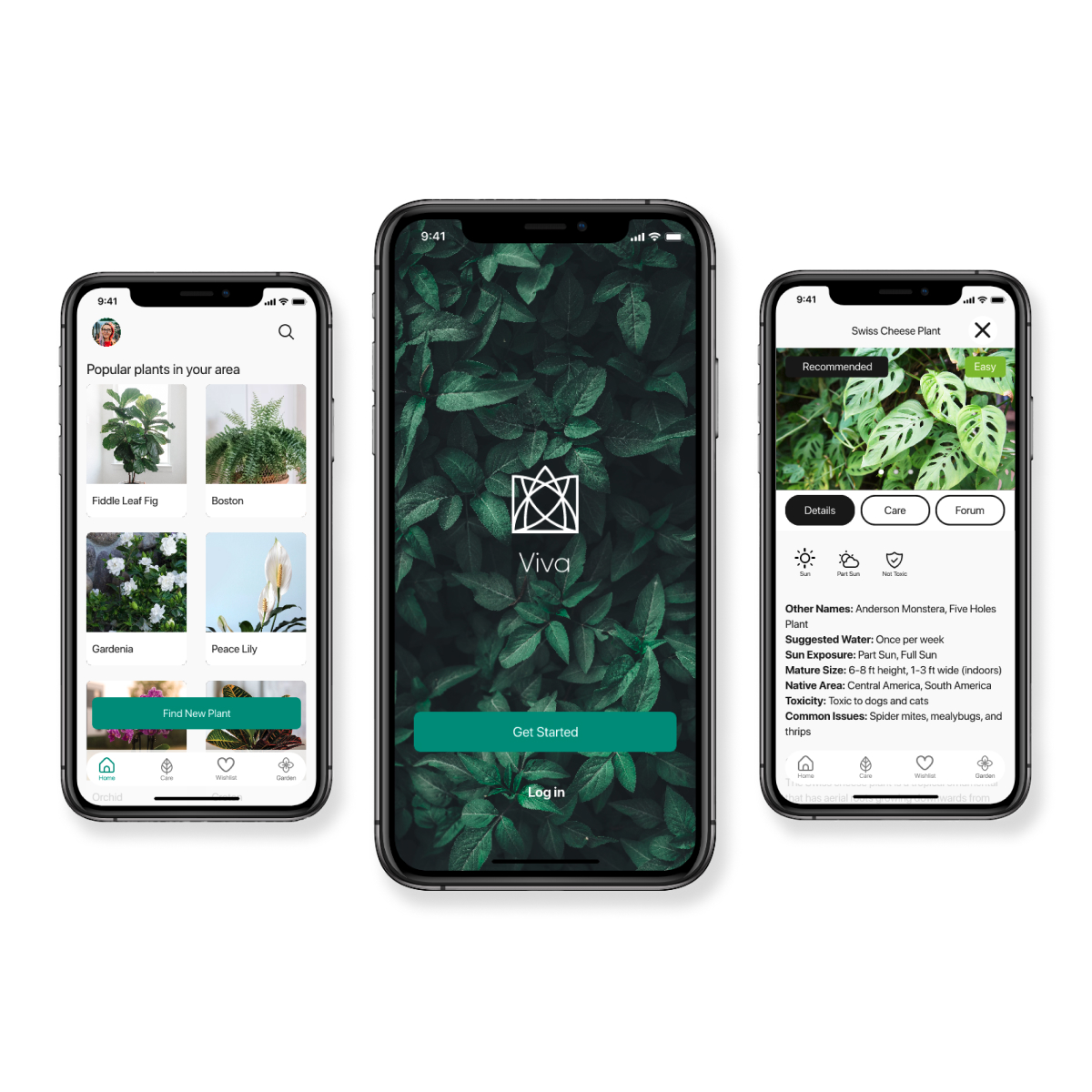
Meet your new best frond forever!
A plant care app
Find your perfect plant match based on the environment it will live in and your level of expertise. Have your plant’s care information handy and a community to root for you!
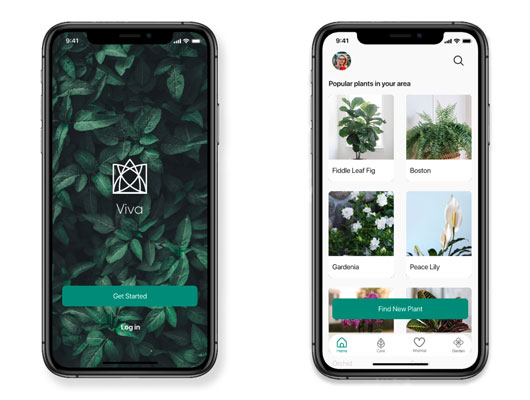
See it in action!
Overview
Duration
Four Weeks
Problem
People may purchase plants based on their looks instead of choosing them based on the conditions the plant will live in. This can lead to the death of the plant because the owner does not know how to properly take care of it.
Design Role
- UX Design
- Visual Design
- Brand Identity

Design Deliverables
- User Survey
- Competitive Analysis
- User Personas
- User Stories & Flows
- Wireframes
- Wireframe Prototype
- Brand Style Guide
- Usability Testing
- Hi-Fi Prototype

Design Tools
- Draw.io
- Maze
- Sketch
- Invision Studio
- Invision App
- UsabilityHub
- Usability Tests
Discovery Phase
User Surveys
Getting to know the users
The main objective of the initial survey was to clear up assumptions and learn if the problem I had identified was indeed a common problem for plant owners. I also wanted to better understand the targeted audience and their habits, motivations and frustrations. As a requirement to complete this survey, participants had to identify themselves as “plant enthusiasts”.
User Research Findings
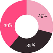
Amount of research participants did before purchasing a plant:
- 29% None
- 32% Light
- 39% Moderate
- 0% Extensive
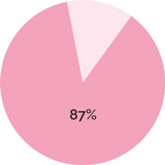
87% of respondents have had a plant that died because they didn’t know how to take care of it. From that percentage 89% of them expressed feeling frustrated when that happened.
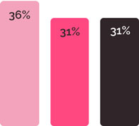
Times when participants did research about their plant care
- 36% Several times per year
- 31% Several times during the year
- 31% Only when there is something wrong with it
Competitive Analysis
Where does Viva sit in the marketplace?
I identified the top 2 plant care apps on the apple store: Blossom and Planta. Blossom offers a plant identification feature and detailed care information. Blossom does not offer many resources to find information when the user’s plant is sick.
Planta has a large species inventory with in-detail care information. It also has a chat box feature that gives treatment advice when a plant is sick. Reviewers complain that this feature is limited and with “cookie-cutter” type of information.
User Personas
Bringing users to life
I created two user personas to help me focus on the needs of real users instead of drawing from assumptions. Andrea and Ben helped me guide every decision about the functionality and look of the app.

Andrea
Having plants around my home brings me peace
Goals:
- Collects items that will help her turn her home into the perfect sanctuary.
- She wants to turn gardening into a hobby.
Frustrations:
- Andrea feels frustrated when her plants die.
- Sometimes her plants have a problem she cannot solve on her own.

Ben
I am always in the look-out to add a new plant to my collection
Goals:
- Growing his plant collection.
- Keeping his plants healthy.
Frustrations:
- Ben has a large collection and sometimes it is difficult to keep track of each plant’s proper care.
- Ben has no one to share his gardening interests with.
Information Architecture
User Stories and User Flows
Defining user’s goals
Before beginning to design a MVP, I identified some user stories for new and returning users and I ranked them based on their priority.
| Role | Task | Importance |
|---|---|---|
| As a returning user | I want to see my plant collection. | High |
| As a returning user | I want to see the care details for a plant. | High |
| As a returning user | I want to add a plant to my collection from my wishlist. | High |
| Role | Task | Importance |
|---|---|---|
| As a new user | I want to identify what plants fit my plant care skills. | High |
| As a new user | I want to see care information about the plant I am interested in. | High |
| As a new user | I want to save a plant I would like to get. | High |
Wireframes
It all begins with pen and pencil
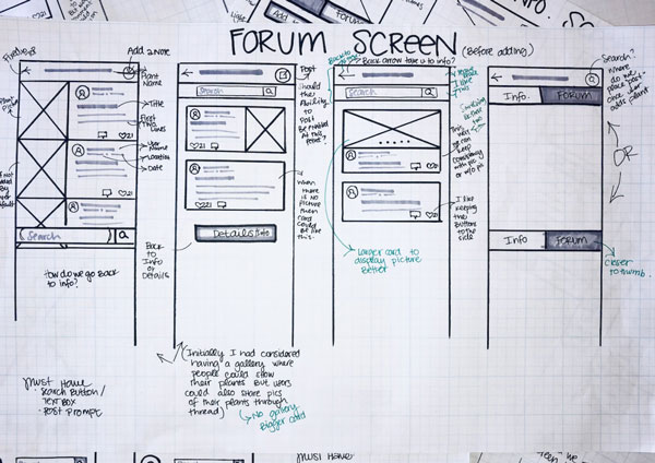
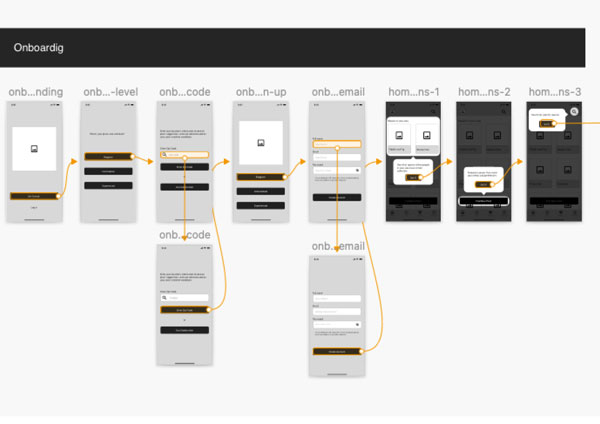
I used the user stories and user flows to guide the design of the first wireframes which were done in paper form. I personally enjoy working with pencil and paper as it allows me to rapidly create several versions of the screens. Once I had a solid design, I created a low fidelity wireframe.
Usability Test
Getting feedback on the foundation
Testing at an early stage of the design is key to avoid spending time and resources correcting a finished product. With that in mind, I submitted a low fidelity prototype to a usability test. The feedback from the participants allowed me to have an insight about the thought process of real users.
After the user’s feedback, I went back to the design board to create the next iteration of the project.
Brand Identity
Finding the brand’s identity
Let's plant it!
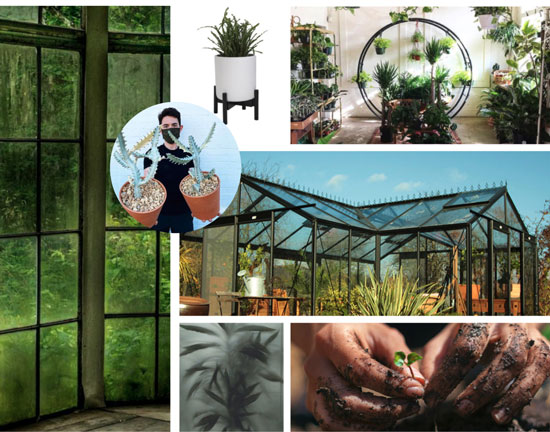
While I was working on the first paper wireframes for this project I realized that the homescreen’s cards resembled windows. It occurred to me that the app's layout looked as if it was composed of windows with plants on the other side. Similar as if a user was walking through a greenhouse. I really liked that idea and did some research on greenhouses.
I noticed the shapes, colors and minimalistic designs that were emblematic of greenhouses. I especially liked the metal structures that held the windows together and I used them for inspiration to create the logo.
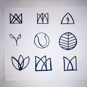
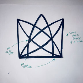


For the name of the app, I wanted something that transmitted the purpose of the app without being too obvious. I decided to use the name “Viva” which means “alive” or “long live” in Spanish and Portuguese.
Mockups
First Hi-Fi iteration
Putting everything together!
After having a clear idea about the direction I wanted to take with the brand identity, I applied it to my design by creating some mockups. Here, I decided to conduct an A/B test to see how people responded to the look and feel of the app. Although I had assumed that users would like a more modern design, they preferred a simple yet function-oriented design. I was really glad to find that my assumptions were wrong and I ended up changing the look of my initial treatment.
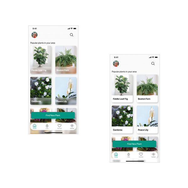
High Fidelity Prototype
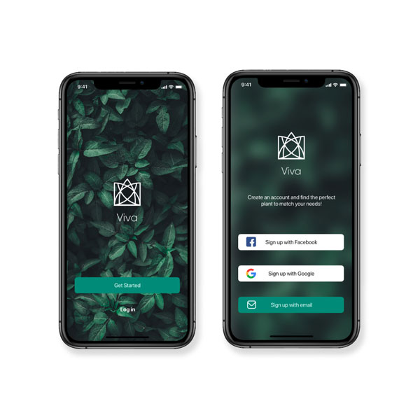
Final Testing and MVP
Refining the experience
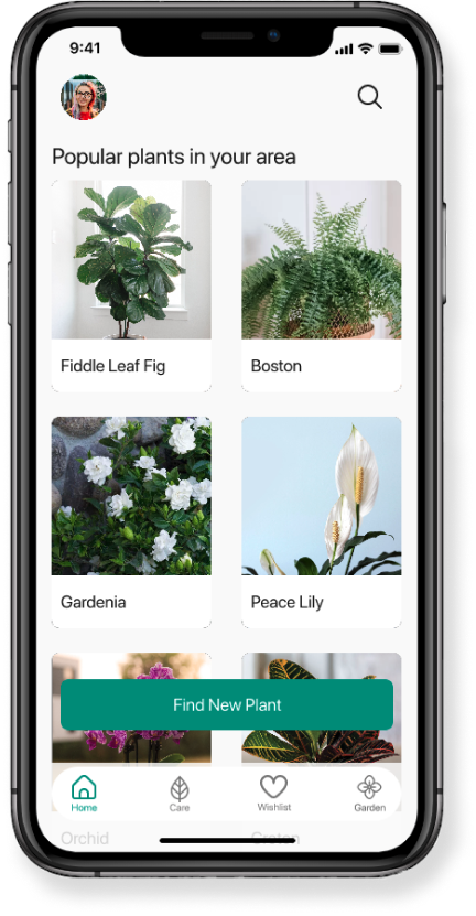
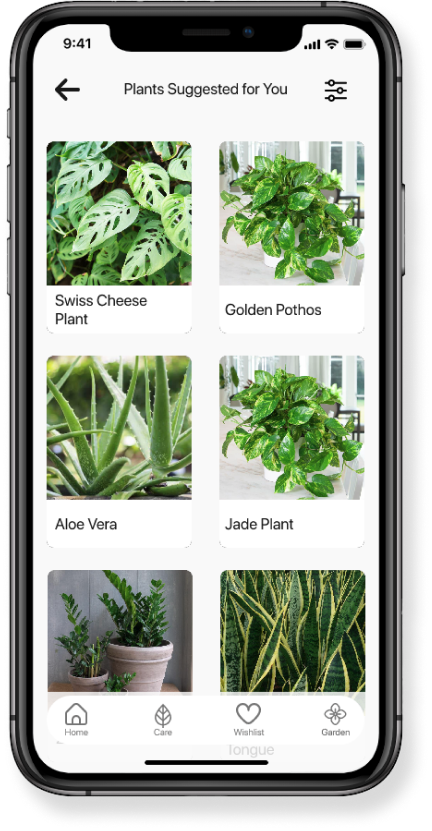
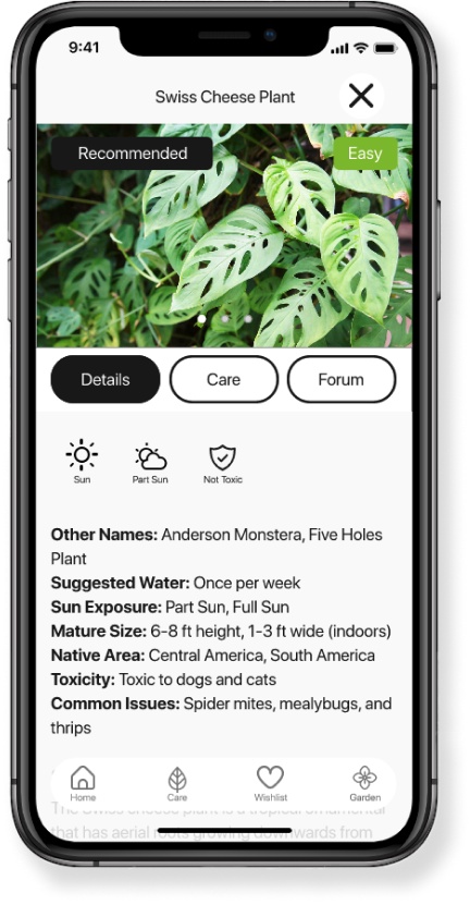
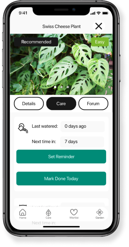
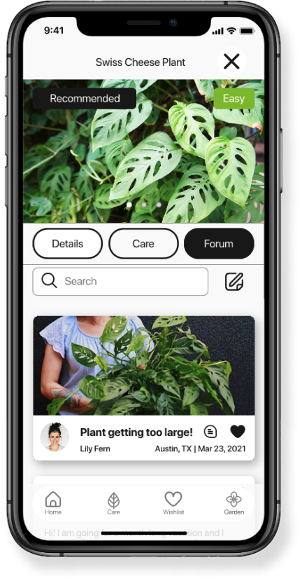
Once I had applied the style guide to my design, I had a high fidelity prototype ready to be tested by real users. I tested my design in person with two participants who shed some light in areas that needed improvement.
Some of the changes I made include: changing a screen title named “Matches” to “ Plants suggested for you” in order to be clear about the information presented on that screen. I also changed the labeling of some buttons and the dimensions of some elements in order to make the overall experiences easier to use.
As always, I was very grateful to have feedback from real testers. Their input was invaluable in order to polish my design and come up with the final MVP.
Conclusion
Key Learnings
Trust the process
At the beginning of this project I had no clear idea of what my design would end up looking like or even what features it would include. I was a little anxious to begin designing without any part of the design already in mind. I was surprised about how each step of the design process helped me define the final MVP. Throughout this project I learned to trust the design process.
